Brand new look, same great team
As you can see, we’ve had a makeover. Whilst this proverbial lick of paint is definitely something worth blogging about, we’re taking the opportunity to talk about the future of Powered by Coffee too.
Powered by Coffee came to be 10 years ago. The agency has known many homes, clients and team members. Whilst the team has largely remained the same throughout the years, as a collective, we’ve developed and refined ourselves behind the scenes. Our services, challenges, and successes have led us to where we are today. We still face challenges and exciting opportunities, but we’re aiming higher than we ever have before, and setting our sights on bigger projects and even bigger wins.
To make this all possible, we needed our brand to reflect where we are now and where we want to be. So we’ve updated our branding so that it better reflects our clients, values, and our position within the industry.
We love our clients and want to work with people just like them
Our clients are digital content or news media publishers. They deal with a whole host of complex website management elements, from heavy database search functions to payment integrations. And for that, they need specialist help. That’s where we come in.
But for new clients, it’s not always been so obvious as to just how vast our in-house skillset is or who we work with. So we’ve updated our services, showcased some of the tooling we created, and interwoven content and news editing themes directly into our visual identity.
Our new visual identity
In recent years, we’ve been steadily maturing, fine-tuning our solutions and client base. Now, our new visual identity better reflects us as the agency we are today.
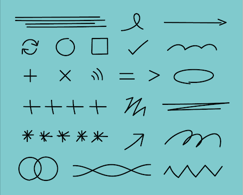
Our colour scheme is vibrant and modern, hinting at our values and approachable way of working. Combined with hand-drawn visual elements, mimicking the lines, scribbles, and notes editors use when reviewing content, our new branding nods to modernity, maturity, and pays homage to our clients.

Using new fonts, our branding continues to make nods to the publishing and editorial worlds. Our headline font, however, is all Powered by Coffee. Modern, effective, and approachable.

At the core of our everyday working lives are our values. Now visualised, they serve as a testament to what we stand for. We’ll always work with integrity, embrace collaboration, empower innovation, and instil trust in our clients and team.
A (big) thank you
Behind the scenes, a core set of (absolutely brilliant) people has brought this new brand to life. Internally, Graeme, one of our talented senior developers, managed the development of the project bringing the site you see today to life. Our Lead Developer, Chris, created the animations and assisted with frontend development. Whilst our Head of Marketing, Coral, led the project and took on the role of UX Designer and copywriter alongside her usual brand management duties.
Externally, we worked with the wonderful team at Design by S-T who took our brief and brought together our new look and feel; a beautiful brand that encapsulates everything Powered by Coffee stands for and represents today. And lastly, Dale Duncan, our talented (and ever so patient) freelance motion graphic designer who took on the challenge of bringing it all to life in our headline video.
Brand new look, same great team. Got a project we can help with? Get in contact here.


